Sometimes, you need time to figure out what you really want – and, perhaps, who you really are.
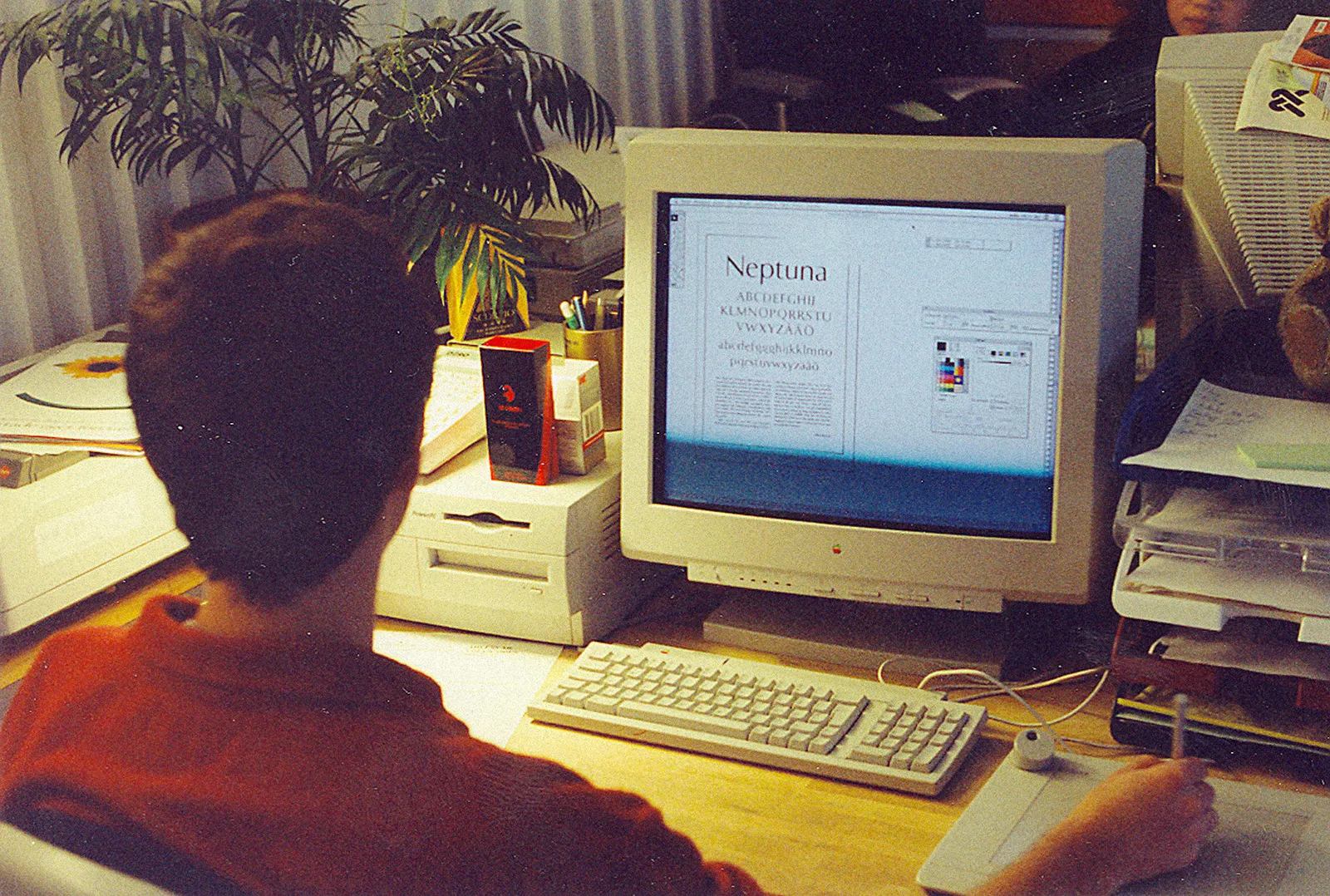
Neptuna was the kind of typeface that wanted to win an argument — every decision and detail pushed further than it needed to. There’s a certain ambitiousness that only someone early in their career can afford to have. Göran’s perspective was fresh. Inspired by the norm-challenging style of the time, from Ray Gun to Emigre, he charged Neptuna with a striking attitude – bézier by bézier.
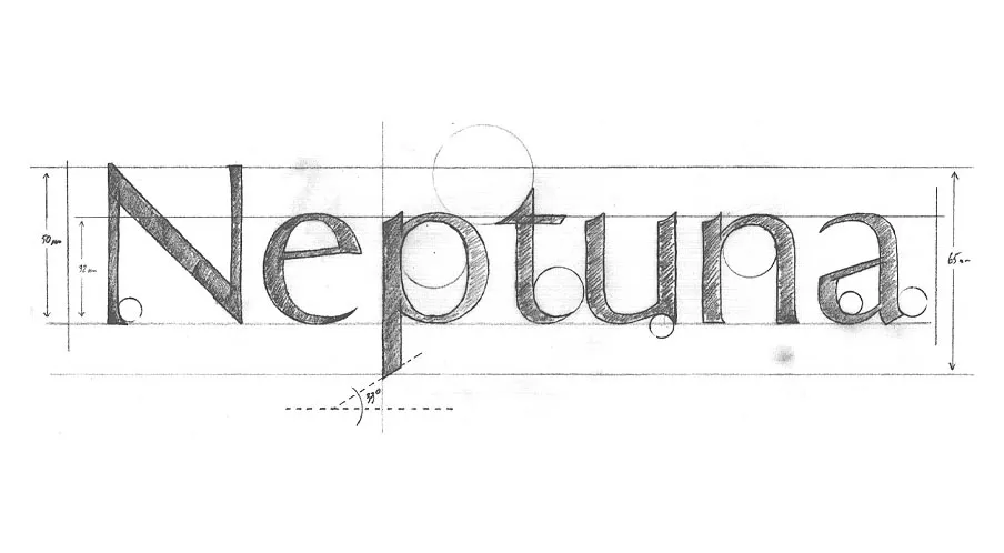
In 2008, Neptuna was renamed and redrawn as Exemplar Pro to be released on the foundry PSY/OPS. When Göran looked back at the first version, he saw many things he no longer liked — things he this time considered plain wrong, or poorly done. All working artists can relate to this feeling: what you’ve done in the past always stays in the past. Looking back can be painful or beautiful; it always reveals a former version of yourself, something you can never return to, whether you like it or not.
Collaboration has a way of editing you. The excesses of Neptuna fell away. It calmed down. The typographic ideas that had survived were stronger for having been tested against other minds. Through that process, Exemplar (2008) emerged with a character that could reach a wider audience — it found its way onto stamps and universities alike.
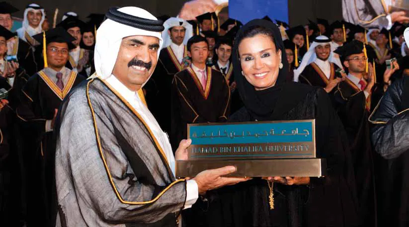
In the years that followed, Göran built a practice that would quietly reach into some of the most considered corners of culture. He designed typefaces for the noblest prize and for the Italian fashion elite — institutions that sit at opposite ends of human ambition, but share an exacting relationship with appearance. His retail fonts spread further still, turning up in places no designer can predict or fully control. He founded Letters from Sweden, a type foundry that became, over time, one of the most respected in Scandinavia.
Seventeen years later, Göran returned to Exemplar one final time. This time it was as much about letting go as creating something new. Exemplar has always been an idea, a maturing concept, an evolution of craft — drawn in endless versions, almost like a meditation. The third version doesn’t argue. It simply is. It is the work of an eye that has spent a lifetime learning to see.
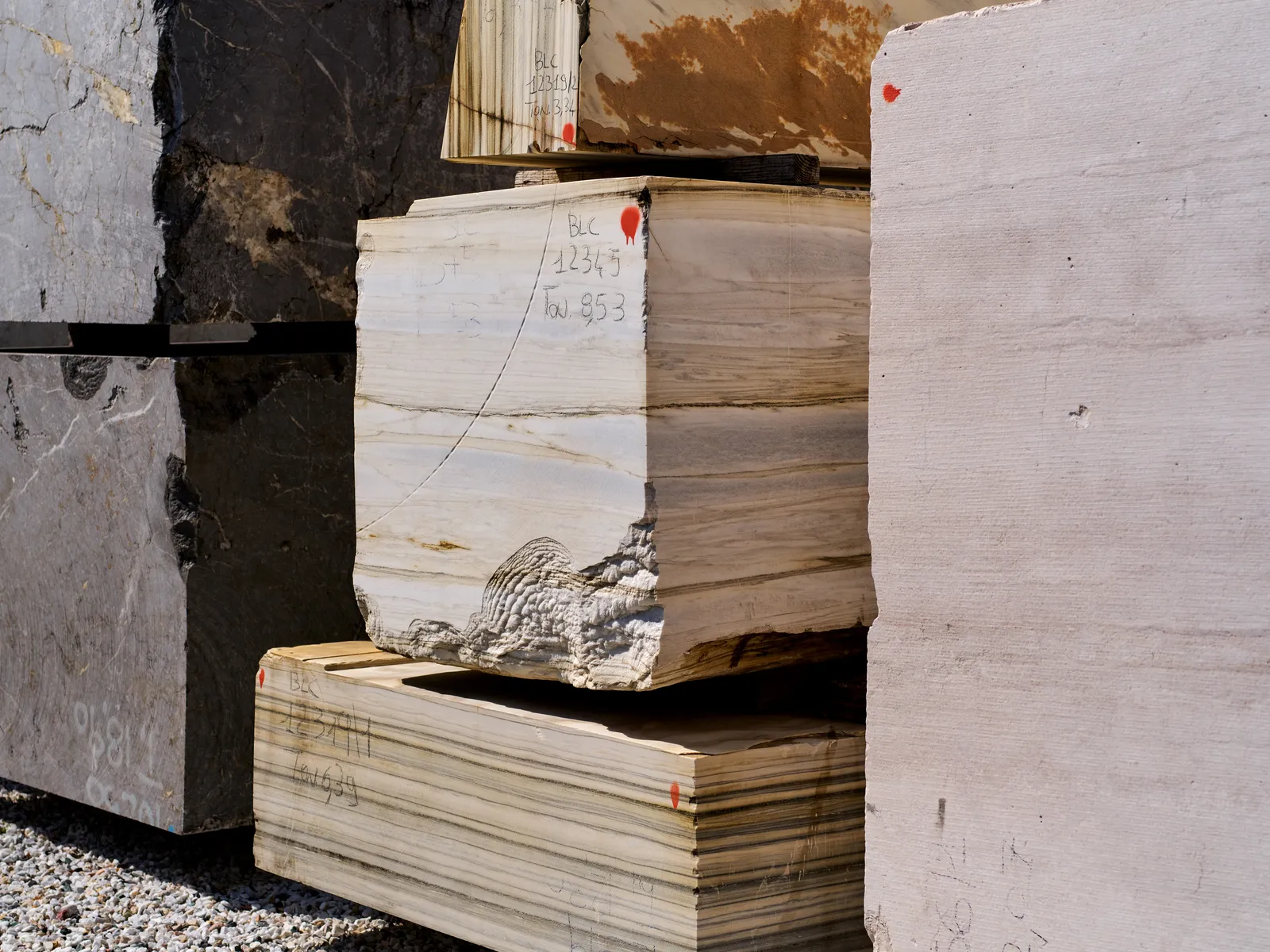
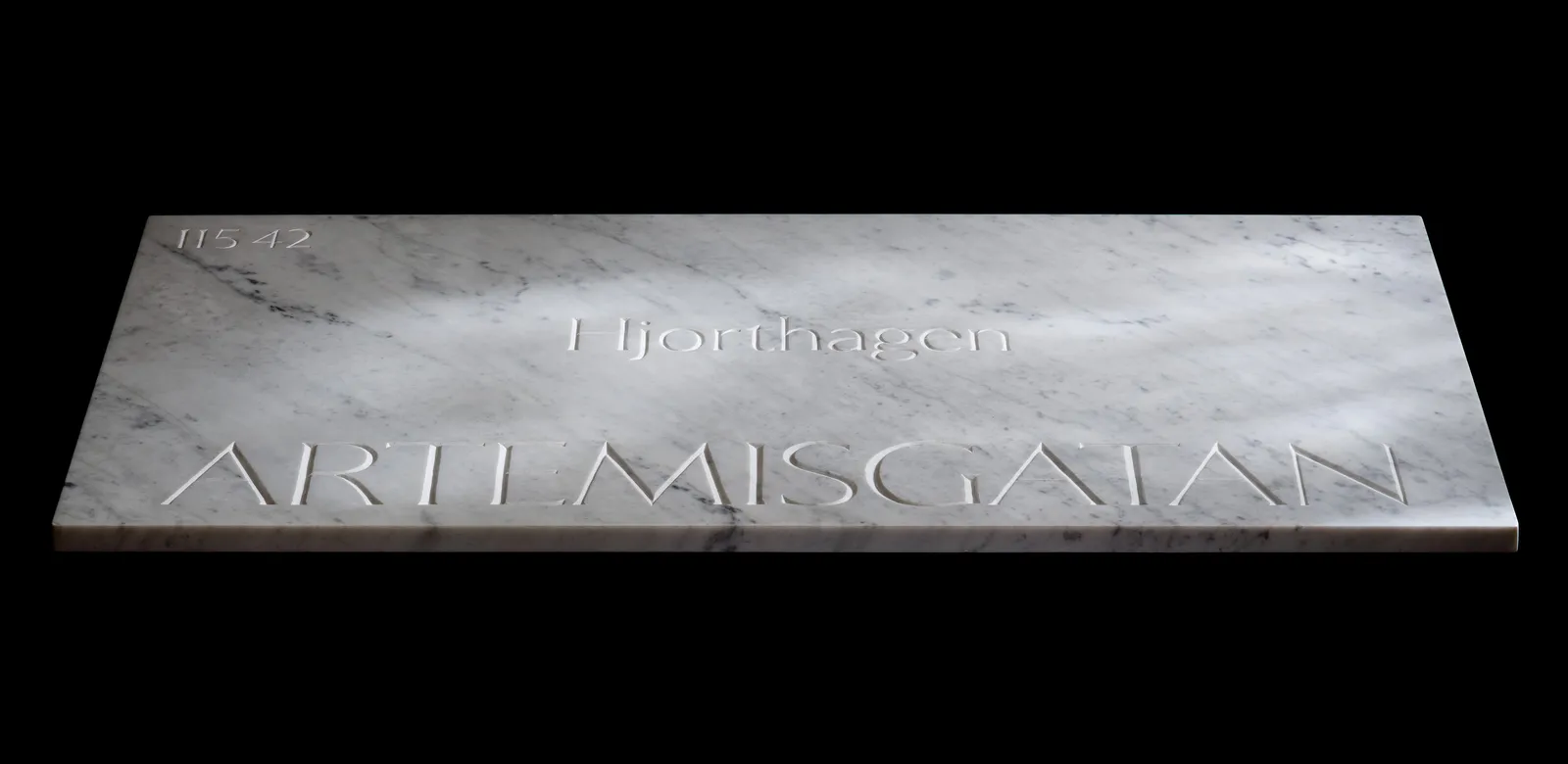
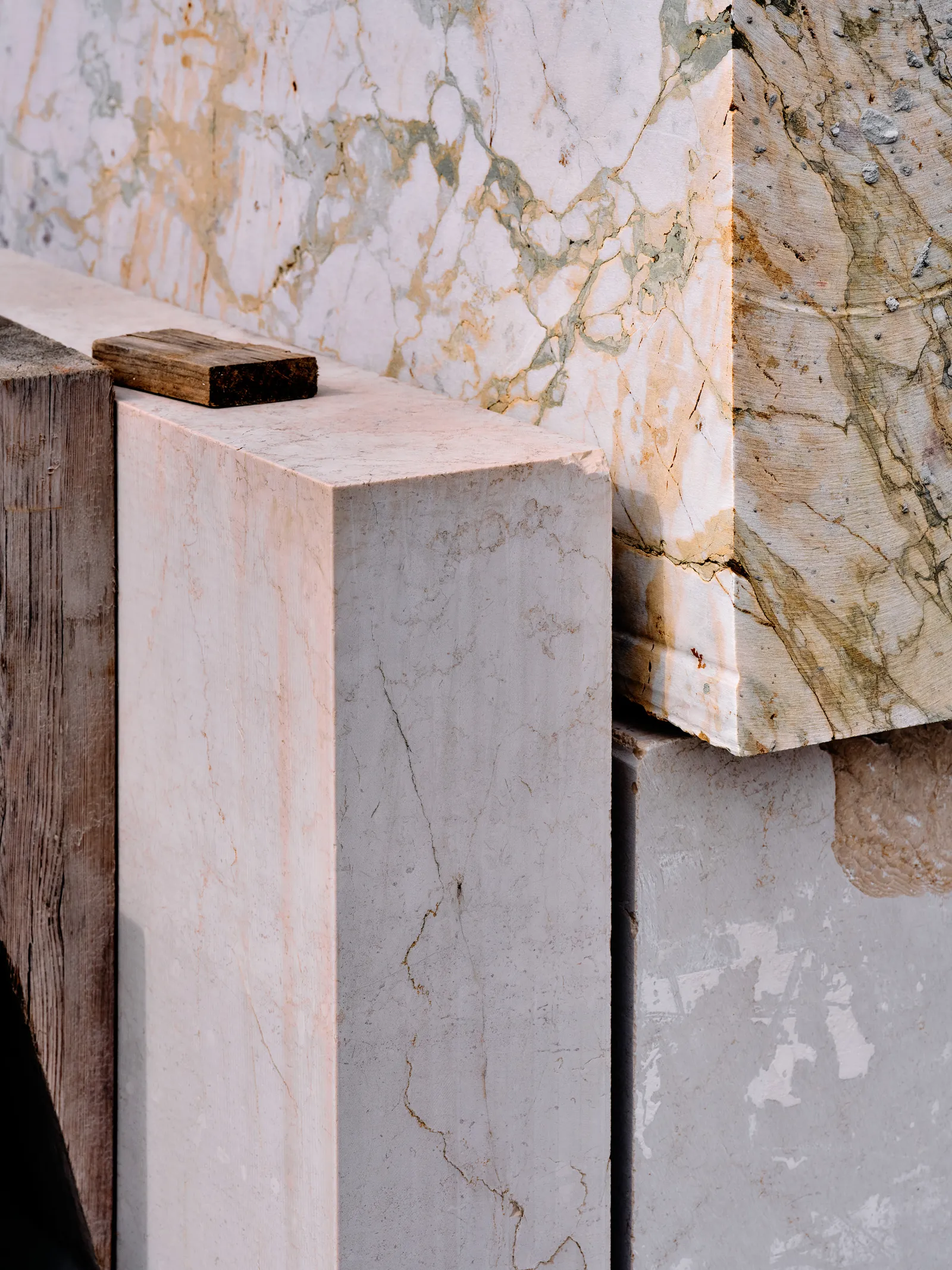
To mark its final release, we decided to set the record in stone. Literally. Carved in marble — just like the first Latin letters cut into Roman stone two thousand years ago — Exemplar’s characters will now live on forever. Three signs. Three addresses: one in the neighborhood where a young man drew his first letters, one where he refined them, one where he finally understood what he’d been trying to say all along.
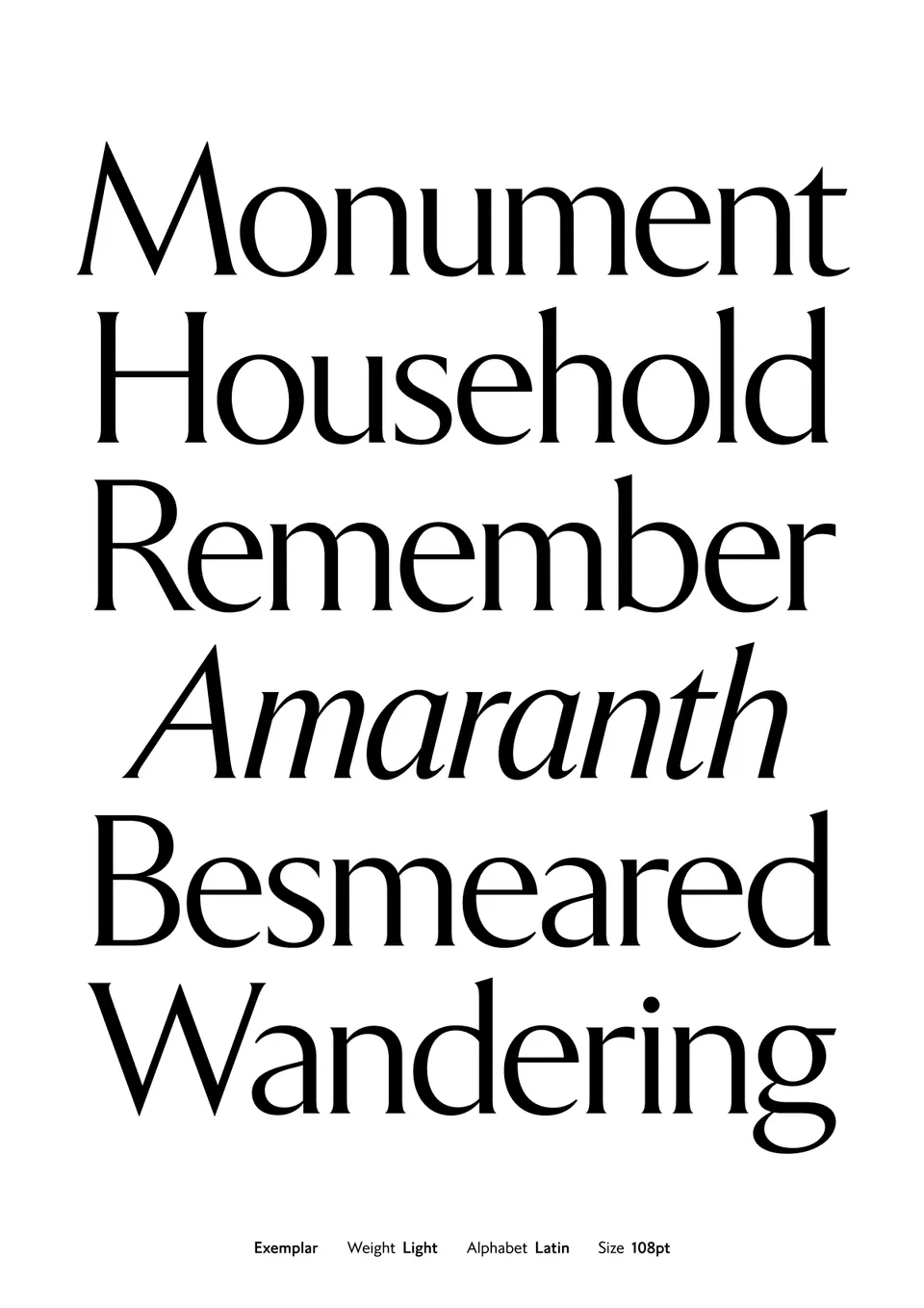
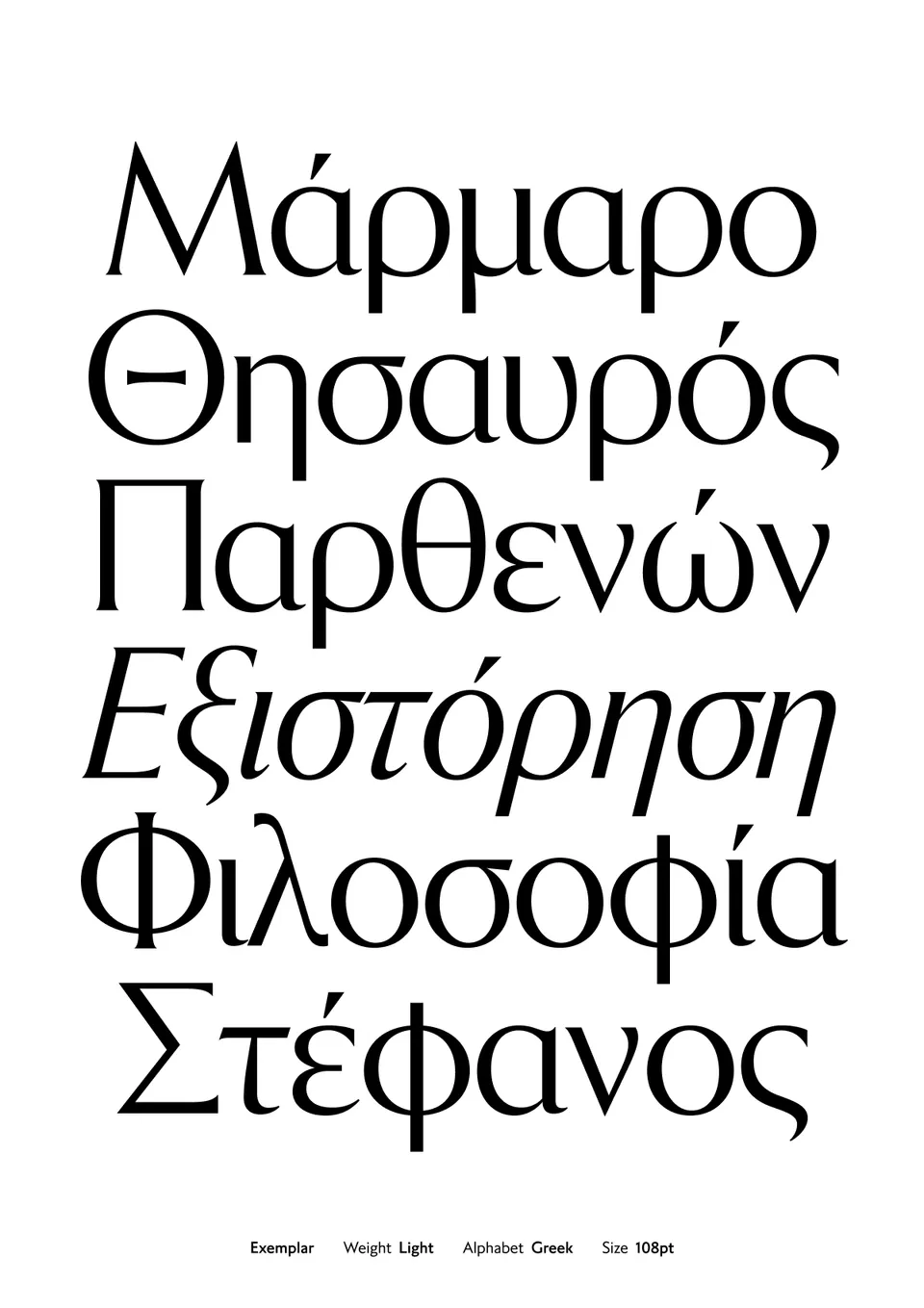
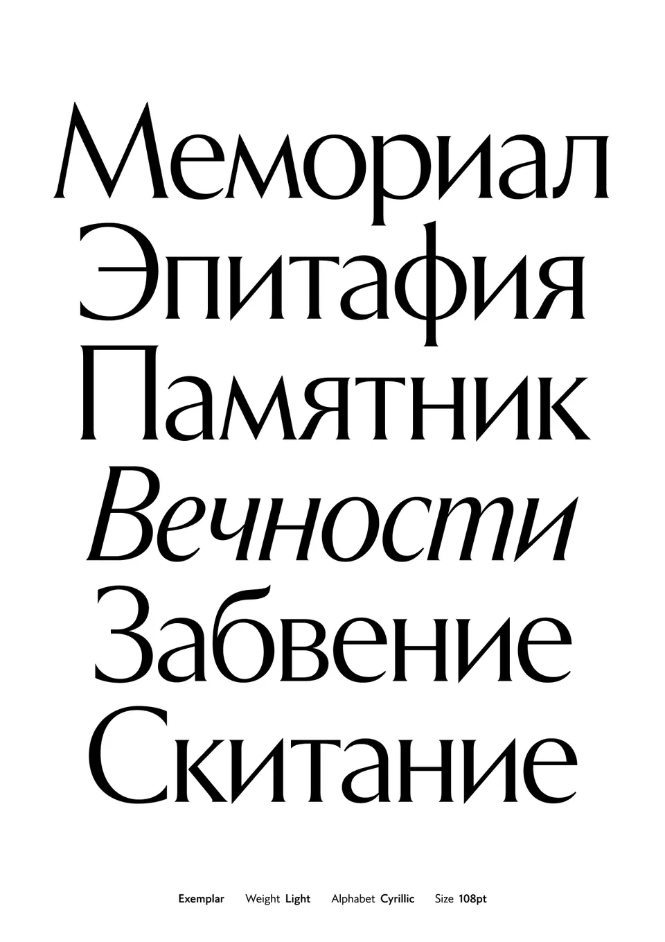
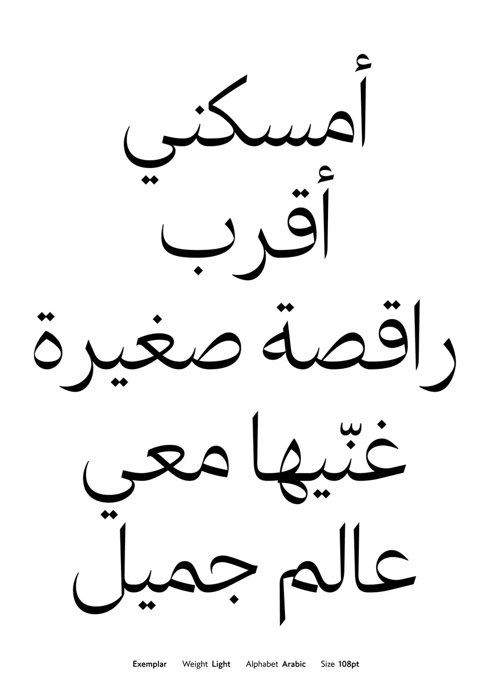
And once grandeur is introduced, there’s no backing down. Exemplar (2026) comes in four scripts: Latin, Greek, Cyrillic, and Arabic.
A life’s work, made permanent at last.